Feature Summary
The chart feature supports visualizing spreadsheet data, including bar charts, line charts, pie charts, and more, intuitively presenting data relationships and trends.
Feature Description
| Feature Dimension | Description |
|---|---|
| Membership Restrictions | Some styles require a membership subscription |
| Version Restrictions | No version restrictions |
Steps
Inserting a Chart
Feature Entry
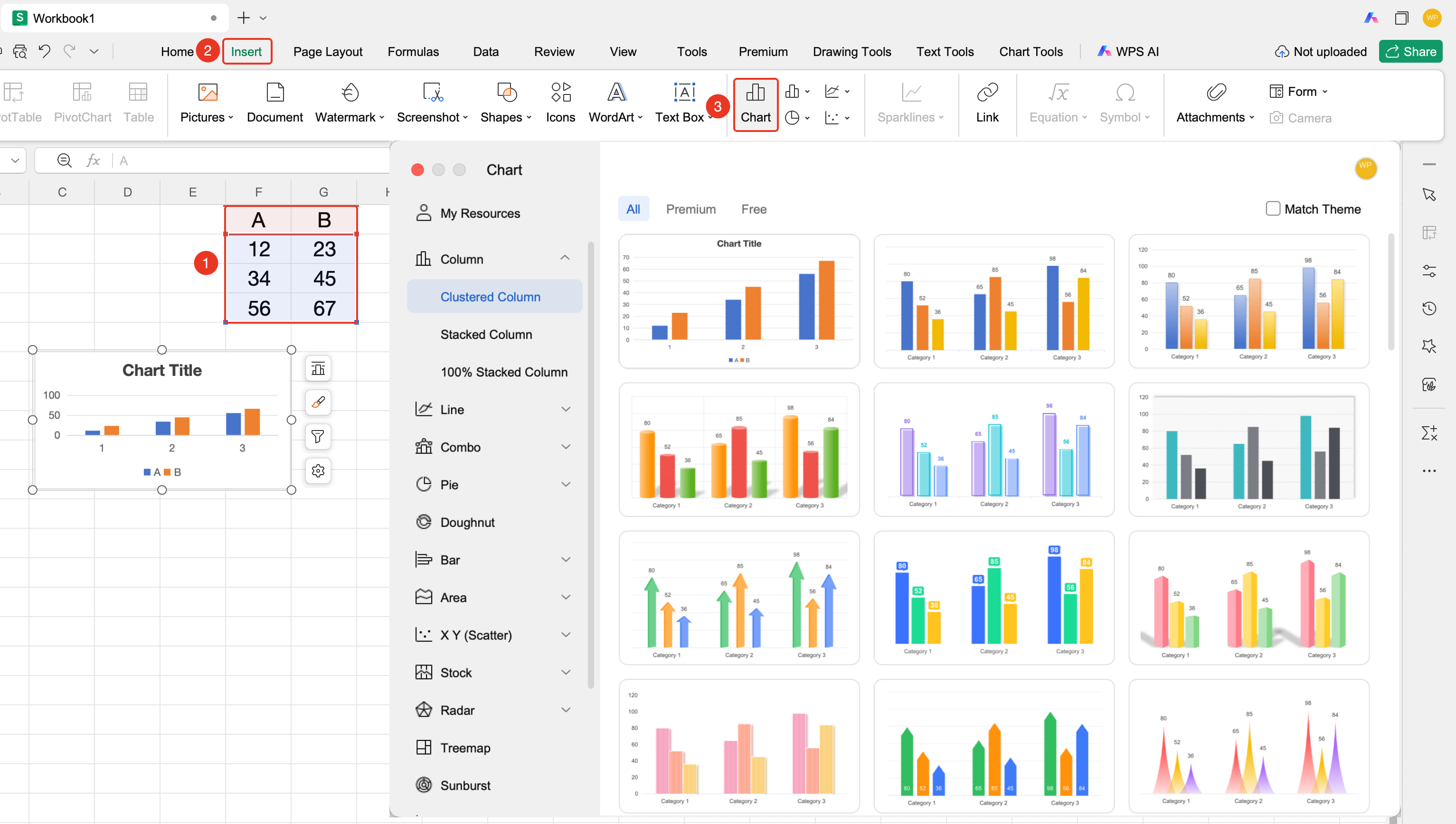
"Insert" tab → "Chart" button
- Organize the spreadsheet data you want to visualize
- Click the "Chart" button in the "Insert" tab
- In the pop-up dialog, select the chart category on the left (Column, Line, Pie, and so on) and the specific sub-style on the right
- The chart is automatically inserted into the current worksheet
Editing a Chart
Feature Entry
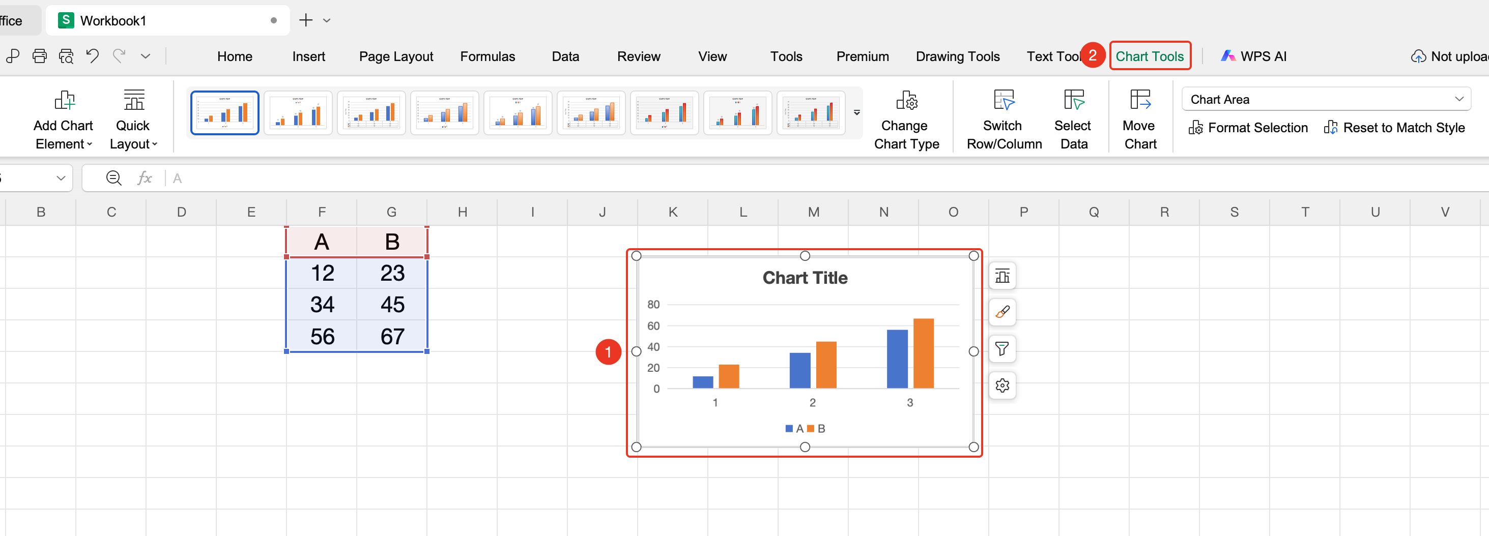
Select the chart → "Chart Tools" tab
- After clicking to select the chart, the "Chart Tools" tab automatically appears on the ribbon, containing the following common buttons: Add Element, Quick Layout, Change Type, Switch Row/Column, Select Data, Move Chart, Format, Reset Style
- Click the "Change Type" button to modify the chart type in the pop-up window
- Use the "Add Element" drop-down button to add chart titles, data labels, legends, trendlines, error bars, and other elements
- A floating toolbar appears on the right side of the chart, providing quick access to chart styles, element editing, filtering, settings, and more
- After selecting the chart or a chart element, right-click and select "Format Object" to fine-tune colors, fonts, borders, and other styles in the properties panel on the right
Exporting a Chart as an Image
Feature Entry
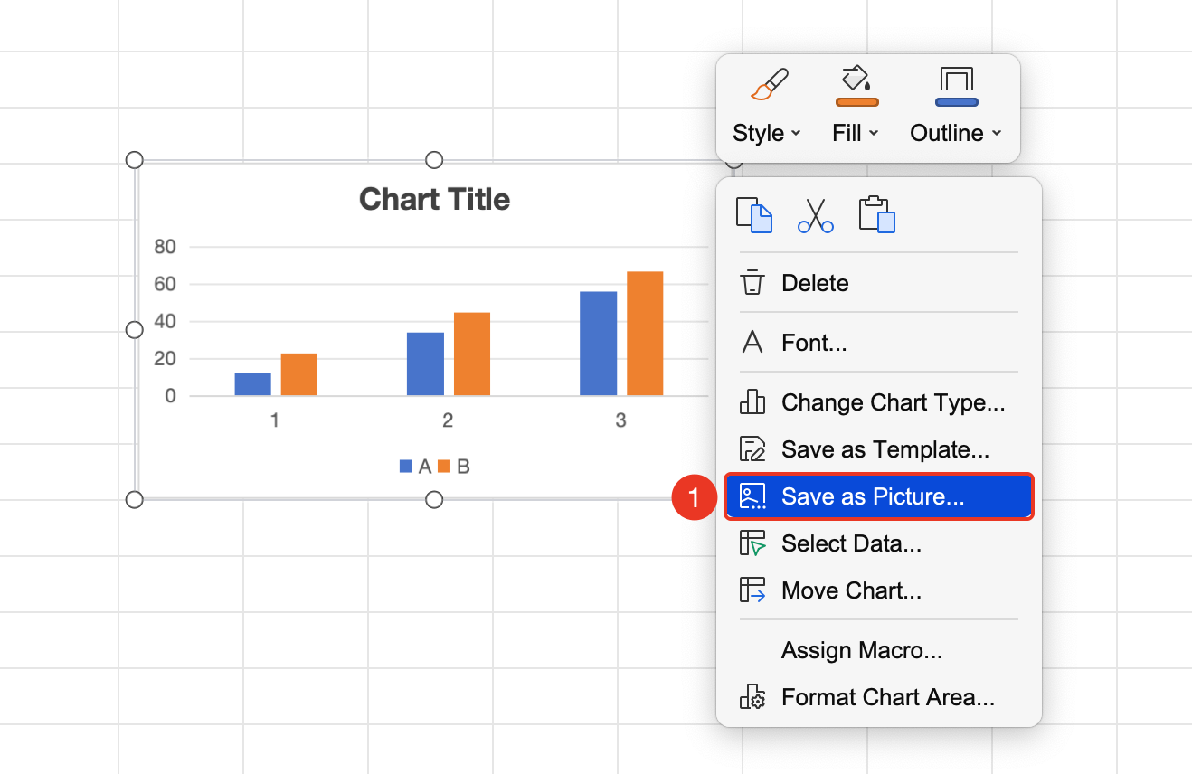
Select the chart → Right-click → "Save as Picture"
- After clicking to select the chart, right-click on the chart
- Select "Save as Picture" from the context menu
- In the pop-up window, choose the save location and image format (JPEG, PNG, etc.), then click Save
FAQ
Q1: How do I modify the chart data source?
- Solution: Right-click the chart and select "Select Data". In the pop-up window, you can modify the data range for data series and category axis.
Q2: Can the chart type be changed at any time?
- Solution: Yes. After selecting the chart, click "Chart Tools" → "Change Type" to switch to another chart type at any time. The data will adapt automatically.
Q3: How do I delete a specific data series from the chart?
- Solution: Right-click the chart and select "Select Data". In the data series list, select the series you want to delete and click "Delete".
Q4: How do I display data as percentages in the chart?
- Solution: After selecting the chart, click "Chart Tools" → "Add Element" → "Data Labels" → select "Percentage". Alternatively, right-click the data labels and select "Format Data Labels" for detailed settings.
Q5: What should I do if the data appears incomplete after inserting the chart?
- Solution: Right-click the chart and select "Select Data". In the pop-up window, re-select the correct data range. If rows or columns have been added or deleted from the original data, it is recommended to delete the chart and re-insert it to ensure accurate data matching.
Notes
- It is recommended that the data range includes headers, so the chart can automatically identify series names
- For complex data, it is recommended to choose the chart type that best expresses the data relationships
- After insertion, the chart can be dragged to adjust its size and position at any time
- After selecting a chart, the "Chart Tools" tab is only displayed while the chart is selected. It will automatically hide when you click on other areas